
Growth is messy. Your branding shouldn’t be.
Sydney Signage and Print Services is basically the “make it look the same everywhere” department: design, print production, install crews, plus the digital layer (screens, content updates, integrations) so the brand doesn’t fracture as you add new sites, vehicles, campaigns, and partners.
And yes, you can scale it without torching your budget, if you stop treating signage like random one-off orders.
Hot take: inconsistent signage is a tax on your business
You pay it in slower decisions, weaker trust, and constant rework. I’ve seen brands spend more fixing “almost right” signage than they would’ve spent building a tight system from day one with reliable Sydney signage and print support.
If your window decals feel premium but your brochures look like a different company, customers notice, even if they can’t explain what’s off.
One-line truth: Consistency is a conversion tool.
Brand consistency across channels (aka the unglamorous secret weapon)
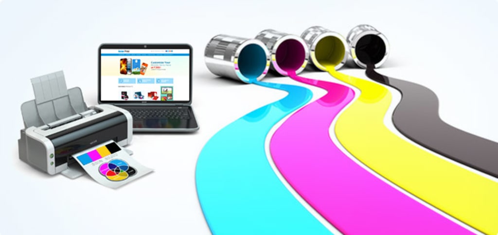
Here’s the thing: signage isn’t only “branding.” It’s the physical interface between your business and real people trying to make quick choices.
At street level, customers don’t politely study your logo. They scan. They interpret cues. Then they decide if you’re credible, open, relevant, safe, expensive, cheap, trendy, old-school… all of that, in seconds.
A few high-leverage consistency points:
– Color matching: Not “close enough.” Actual matching across substrates, lighting environments, and print methods. A red on vinyl can drift fast compared with a red on coated paper.
– Typography discipline: Same families, same hierarchy, same tone. If your main sign yells in bold condensed caps but your flyers whisper in a thin serif, your brand voice is stuttering.
– Image style rules: Photography vs illustration, contrast level, cropping style. Pick a lane and stay there.
Now, this won’t apply to everyone, but if you’re scaling locations, you need a signage playbook more than you need another “fresh concept.”
The problems signage quietly solves (when it’s done properly)
Brand-consistent signage
If you’re trying to grow, fragmentation is your enemy. Standardized signage prevents the slow creep of “each site does its own thing.” That creep always happens. Always.
A decent signage system locks down:
– approved colors (with production specs, not vibes)
– font usage rules
– icon styles
– materials by use-case (indoor, outdoor, high-touch, short-term promo)
– placement logic (yes, placement is part of brand)
The payoff isn’t just aesthetic. It’s operational. Less arguing. Fewer revisions. Faster rollouts.
Uniform visual identity
When your brand shows up consistently across storefronts, vehicles, interior wayfinding, counter displays, brochures, and digital screens, customers feel like they’re dealing with a “real” business, stable, intentional, trustworthy.
And small design choices change behavior. Color psychology isn’t woo; it’s pattern recognition. People respond to repeated cues.
If you want one stat to anchor this: consumers form first impressions extremely fast, within 50 milliseconds in web-based visual contexts (Lindgaard et al., 2006, Behaviour & Information Technology). Physical environments aren’t identical to websites, but the principle holds: people judge quickly, then justify later.
What customers actually see: core signage formats
Not all signage is doing the same job. Some is shouting for attention. Some is quietly reducing friction.
You’ll typically mix formats like:
Storefront + external
– fascia signs, 3D lettering, lightboxes
– window graphics (hours, offers, privacy frosting)
– A-frames and pavement signs for foot traffic
Inside the space
– wayfinding and directional signs
– wall graphics (brand story, product categories)
– point-of-purchase displays and counter cards
Mobile and distributed
– vehicle wraps (full, partial, cut vinyl)
– event banners and pop-ups
– partner-location signage kits (for resellers, clinics, cafés, gyms, whoever hosts your message)
Material choice is not a footnote. UV, salt air, vibration, adhesive lifespan, cleaning chemicals, those decide if your “premium” sign still looks premium in six months.
The workflow: design → proof → install (and where projects go wrong)
People treat installation like the last step. In reality, installation constraints should shape the design early. Measurements, sightlines, council rules, access limitations, lighting, fixing methods, all of it.
A good workflow feels more like a loop than a straight line:
- Briefing that includes the environment
Not just “make it look modern.” Where is it going? What’s the viewing distance? What’s competing for attention nearby?
- Production-ready artwork
Vector where it needs to be vector. Correct bleeds. Correct color profiles. Font licensing handled. No surprises.
- Proofing that’s more than spelling
Color accuracy, substrate selection, lamination choice, anti-graffiti coatings, readability checks under real lighting.
- Install planning (permits + safety)
Timed access, traffic control if needed, lift equipment, compliance. If this isn’t planned, costs balloon fast.
Look, I’m opinionated here: if your signage provider can’t explain their proofing process clearly, you’re gambling.
Multi-channel reach: banners, signs, wraps (the “show up everywhere” combo)
Vehicle wraps are underrated. They’re also easy to mess up.
A wrap that looks gorgeous parked can become unreadable at 30 km/h if you ignore letter height, contrast, and spacing. Big shapes. Strong hierarchy. One message per viewing moment.
Banners and temporary signs fill in the gaps: events, promotions, construction hoarding, seasonal pushes. They’re the quick-change layer on top of your permanent brand assets.
A practical rule I use: keep the brand constants constant (logo position logic, core colors, type system) and rotate the campaign elements (offer, dates, hero product) without reinventing everything.
Print that moves people along a journey (brochures, postcards, flyers)
Print is not dead. Bad print is dead.
Good brochures and postcards do something digital often fails at: they stay in the environment. On desks. In cars. On kitchen benches. They get seen repeatedly, which is basically free frequency.
What works in real life:
– clear information hierarchy (headlines that earn attention, not paragraphs that beg)
– consistent brand voice (friendly, clinical, premium, playful, choose deliberately)
– durable stocks where handling is heavy
– QR codes that actually go somewhere useful (not just your homepage)
In my experience, the strongest print programs aren’t “pretty.” They’re structured. The reader always knows what to do next.
Stock, maintenance, and quick reprints (the operational side nobody glamorizes)
A growing business doesn’t lose money on signage because of design. It loses money because of chaos.
If you want reliability and cost control, you need:
– a basic asset library with version control (one master file, not seventeen “FINAL_v4_reallyfinal.pdf”)
– standardized materials for repeat items
– scheduled checks for fading, peeling, LED failures, scratched acrylic, tired-looking laminates
– a reprint protocol with one approver (otherwise reprints become committee theatre)
Batch pricing can help margins, but only if your inventory discipline is real.
Choosing a signage partner in Sydney: what I’d screen for
Some vendors are great printers but weak at project management. Others install beautifully but can’t keep color consistent across jobs. You want the boring combination: craft and systems.
Criteria I’d actually care about:
– Quality control: how do they ensure color consistency across different print runs and materials?
– Capacity: can they handle multi-site rollouts without slipping timelines?
– Installation competency: licensed, insured, safety-first, permit-aware
– Samples + references: not curated hero pieces, but repeatable everyday work
– Communication: clarity beats friendliness; you need both, but clarity wins
Sustainability matters too, if it’s part of your brand values, ask what substrates, inks, and disposal practices they use. You’ll learn quickly if it’s real policy or just brochure copy.
Digital signage + online integration (where physical meets “updateable”)
Digital signage is the scaling cheat code, when it’s connected to the rest of your system.
If your screens show promotions that don’t match your website, your staff scripts, or your printed offers, the tech is actively working against you. The goal is synchronicity: pricing, inventory messaging, seasonal campaigns, even location-specific content that updates without a reprint.
And yes, augmented reality and interactive elements can be powerful (especially for product visualization), but don’t chase shiny features unless the basics are tight: readable layouts, consistent branding, clear calls to action, and measurement.
Pick KPIs you can defend:
– dwell time
– interactions (touches, scans, completions)
– uplift in promoted product sales
– queue reduction for kiosks
Digital signage should behave like a living extension of your brand, same voice, same design rules, just faster to change.
If you build signage and print as a system, not a series of emergencies, you get something rare: brand consistency that stays consistent while the business keeps moving. That’s the real win.